More than 60% of listeners said that the artwork is the most important element in their decision to buy an album, right after the music itself.
Let us help you create a cover that catches the eye, intrigues, and evokes emotion!
All the apps we use – websites, youtube, Facebook, or Spotify – show music covers at an incredibly fast pace. They need to catch the eye within a few milliseconds for the viewer to pay attention for longer. The same happens in stationery shops where the listener chooses a CD among other proposals. If the design is made using the 3P method created by our company, i.e. professionally, precisely and with passion, what we want will happen. The recipient will notice the cover.
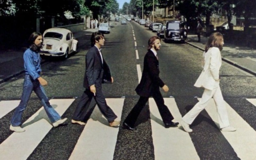
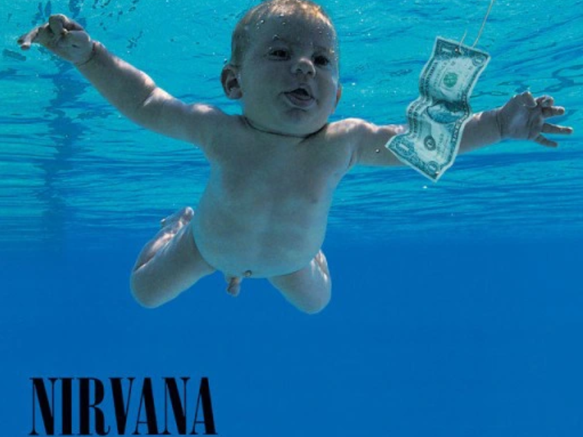
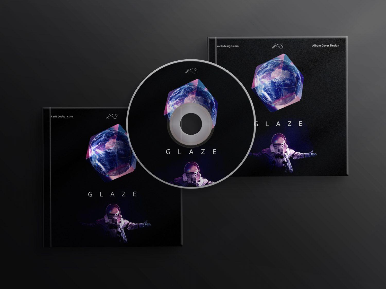
Covers that catch the eye and are remembered are a combination of three elements: detail, idea, and graphics. Take note of the three album covers below and notice how recognizable they are around the world. Note that the best albums are first and foremost great music, but also great graphic covers that are adopted and associated around the world.

A music cover design must catch the eye, stand out from the rest, show emotion, and sell. To ensure this we pay attention to the colors, style, font, atmosphere, and overall composition of the design. The colors mentioned first are no coincidence at all.
As research shows, as much as 65% of customers consider color to be the most important element when choosing products.
We create album covers for one main reason: we love music and it is our everyday life. We love listening to it and we create the best designs. Music educates, develops, and stimulates the imagination. For me personally, music has been with me from the beginning of my life until today. I play the piano, train vocals, and dance professionally (hip-hop, high heels – a combination of genres such as ballet, jazz, elements of ballroom dancing, wacking, locking, and contemporary dance).
The 10 steps to creating a unique music cover:
1. We listen to the music for which the album will be designed and/or the artist’s previous works.
We create thorough research, listening to all the songs of the artist for whom the album will be designed. We gather information on the competition and learn all the characteristics of the musical genre.
2. We create an analysis of the sounds in the album to be designed.
We identify the structure, tempo, and intensity of the sounds. We identify the instruments in the pieces and apply a distinction between solo and ensemble music – including chamber and symphonic music.
3. We identify the audience group.
We gather as much information as possible about the artist, their audience, and their musical genre. We ask for all the details about the act in the industry. We conduct an interview to identify the audience group.
Example questions:
How do you imagine the ideal listener?
Which vocalists do you admire?
To what number of listeners would you like to create?
4. Analyse what you would like your audience to feel when listening to your songs?
Music has one very important function: it evokes emotions. It is important for you to determine what you want your audience to feel while listening. We will do the same and check that our visions are consistent.

5. We choose the keywords that will define your album.
With an outline, and an initial analysis, it is worth identifying a few keywords that will be associated with the album of the record, the emotions expressed, and, most importantly, that will be relevant to your listeners.
6. Finding inspiration.
Now another research. We will offer you different graphic styles, different colors, shapes, and sigils. You’ll choose a few options that you like best, and with that, we’ll have a clear point of view on which way we’re going.
7. We match the color palette.
Taking into account your preferences, audience, and color psychology, we will be able to determine the palette that will be most suitable for your album.
8. we don’t forget the right font.
The font seems to be the least important, and it creates a coherent whole. Depending on the visual aspects of your cover, we will choose a suitable font.
Examples of fonts:
Serif (embellished font) – if you’d like to go back in time and record an album with older vibes, this font will work perfectly.
Sans serif- will work well for all online activities, it results in readability and clarity.
9. We choose the whole composition and focus on the details.
At the very end, we check each previous point in turn and, together with you, make a list of final touches. The final touches are amazing because only then can we see the whole project and talk about any changes.
10. we create unique album covers.
We prepare the cover for printing and determine the material, format, and printing structure.
Now you know how we work to create a professional music album cover. A music cover design needs to catch the eye, stand out from the rest, show emotion, and sell. It is the same with the music itself. The music needs to create a whole and inspire and evoke emotion – through sounds and graphic visuals. People need to hear us, see us, and feel us so that they can identify with our sensibility and understand what we want to tell them.
The 10 steps outlined are our key to success. An in-depth and detailed analysis will ensure that your album cover is tailored to both you and your audience. Nobody will pass by it indifferently.


