
01 About project
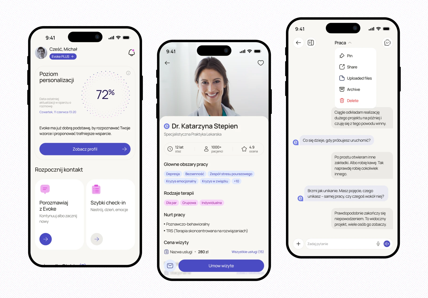
Evoke is a mobile wellness app built around an AI assistant you can actually talk to. You describe what's on your mind, it asks follow-up questions, remembers what you told it, and comes back to it later. Around that conversation sit a dashboard that shows how you've been doing, a library of short practices matched to your state, and a marketplace where you can book a specialist when talking to an app is no longer enough. We designed the full UX/UI: dashboard, chat, practices, the booking marketplace, and the design system that holds them together.
02 Challenges
1. An AI that talks about your mental state — without pretending to be a therapist
The assistant had to feel personal enough that people open up, and clear enough that nobody mistakes it for treatment. That line runs through every screen: how it asks, how it phrases what it noticed, and when it steps back and points to a specialist instead.
2. Proactive, not intrusive
Evoke starts conversations on its own, based on what you said before ("How did the talk with your manager go?"). Done wrong, that reads as surveillance. It had to feel like something remembered on your behalf, not logged about you.
3. One product, two modes
alking to an AI at 11pm and booking a psychologist for next Tuesday are different jobs. They had to live in one app — and the handoff between them had to feel like care, not an upsell.
03 Solutions
1. Dashboard — the state of things, at a glance
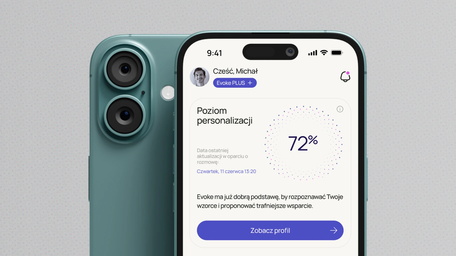
The home screen opens with a personalisation level: how well Evoke has learned your patterns so far, in plain language. Below it, two ways in — continue a conversation, or run a quick check-in on mood and emotions when writing feels like too much.
2. Chat — the core of the product
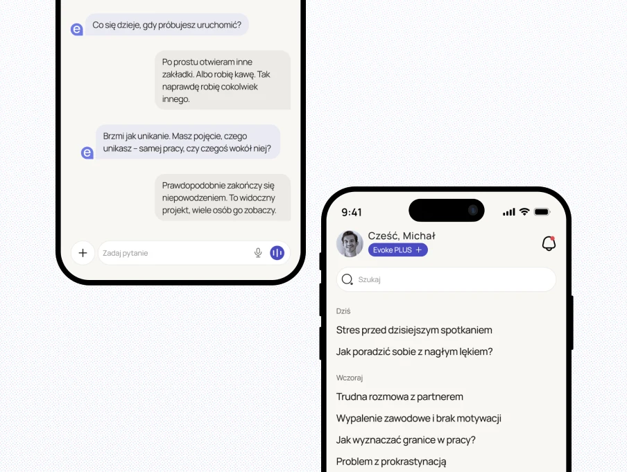
A new chat opens with your name and a few starting points, so the empty screen never feels like a blank page. Input works by text or voice. Conversations are saved and grouped by time — today, yesterday, last 7 days — with search, and each one can be renamed, pinned, shared, archived or deleted.
3. Practices — matched to how you are
The section leads with AI recommendations — an exercise picked for your current state, with the reason for the pick — then recent activities and themes: stress, sleep, anxiety. Every card shows its duration up front, because time is the first thing people check when they're already tense.
4. Specialists — from conversation to appointment
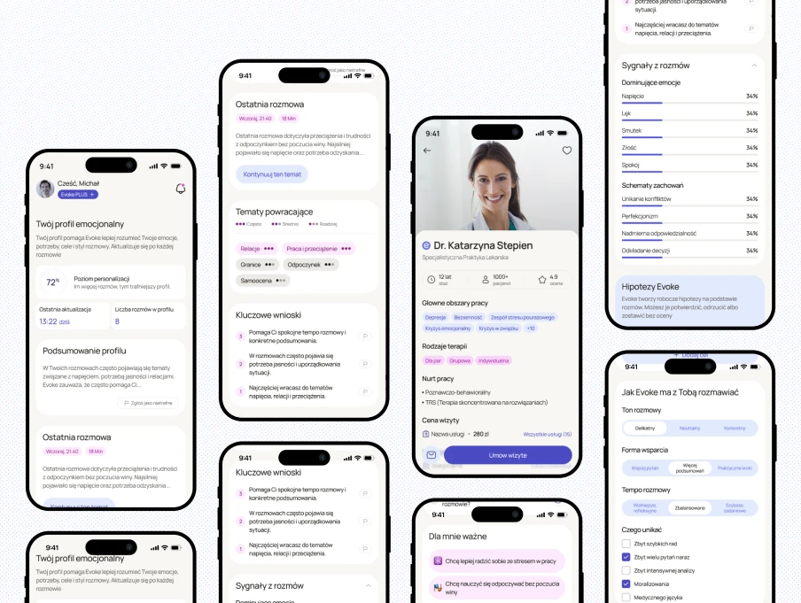
When the assistant sees a pattern that calls for professional support, the next step is already inside the app. Search by service and location, profiles with ratings, reviews, price and address, and available slots shown directly in the results — pick a day, pick a time, book.
5. Design system
Shared components, colour, typography and card patterns across all four sections keep a conversation screen and a booking screen recognisably the same app, and give the team a base to extend.